An art direction call
Exploring creative and inspiring interface solutions for La Nación

Exploring creative and inspiring interface solutions for La Nación


As a result of other experiences from the past (“Soy Liebre” and “La Nación+”), the digital team of the newspaper La Nación invited us to imagine the aesthetic and artistic path that its online portal lanacion.com.ar could take. The slogan was very simple: "freedom to play and propose the art and ideas that we wanted" and then make them transform towards the redesign process that was already underway.
La Nación, part of Grupo La Nación, a business holding company designed to provide communication solutions through its broad platform made up of print newspapers, radio, television channels, magazines, a benefit club and a digital portal, among others. It is a national and independent company, founded on January 4, 1870.
Industry: Broadcast Media Production and Distribution.
Services: Interaction Design.
Type of projects: Website.
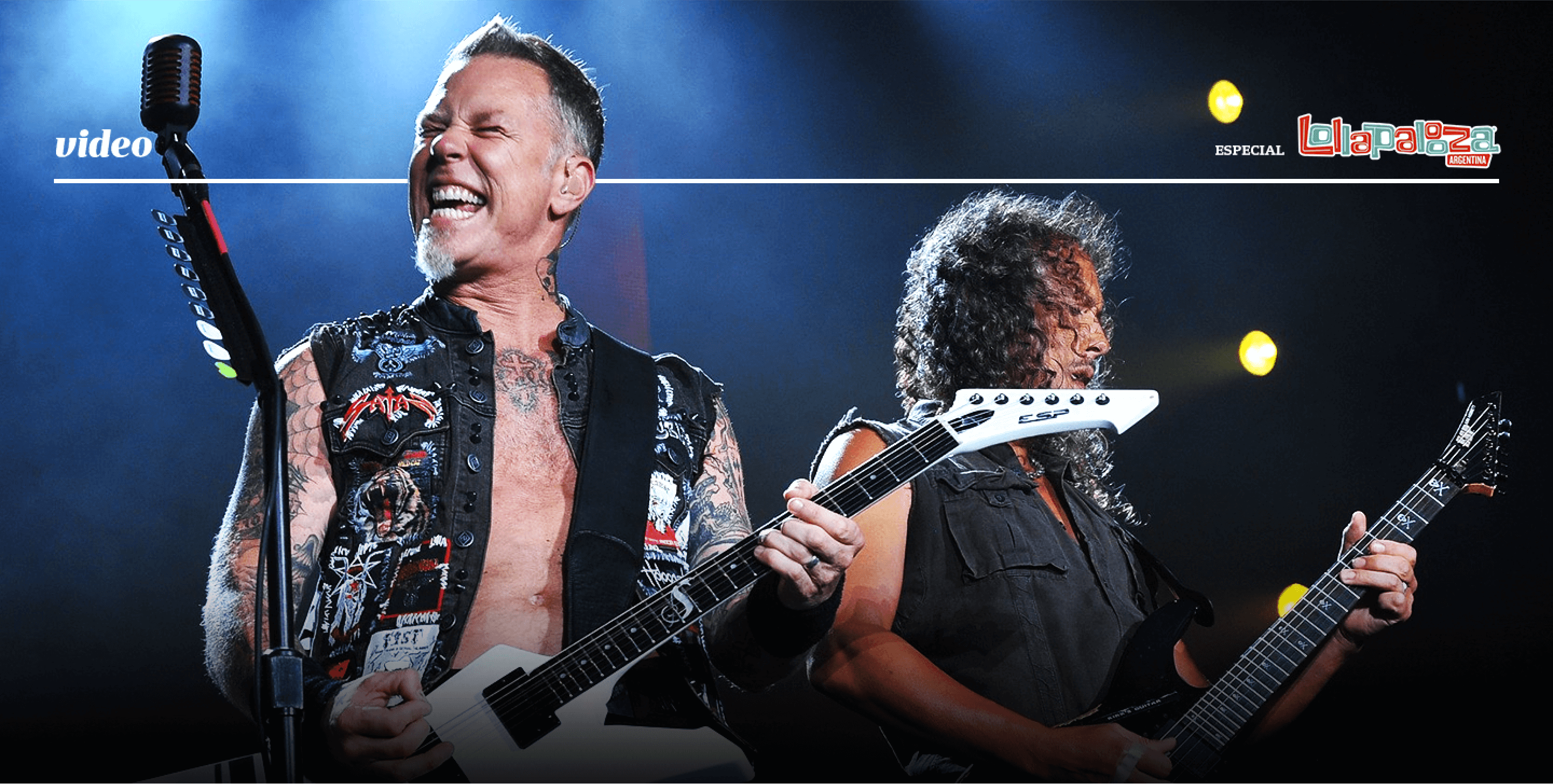
This project consisted of two main parts: The creative exploration and the translation of the findings into usable components within the platform, working together with the newspaper's design and development teams. The calendar was very tight, so we had to have a very strict schedule and precisely define the tasks to be carried out.

Briefing
Sharing expectations, insights & researchs.

Exploring
Exploring ideas and building art proposals.

Defining
Iterate to define what is going to the next phase.

Producing
Designing along with UI & Frontend teams.
As in any game, there must be rules. Since the most fun thing about designing an interface is being able to see it online, it needs to meet certain requirements, that's why we wanted to be honest in proposing ideas that, no matter how rebellious they were, could be implemented in reality and that were aligned with the identity of the digital channel.

Respect the identity of the brand and its digital platforms

Be technologically consistent with the publication flow
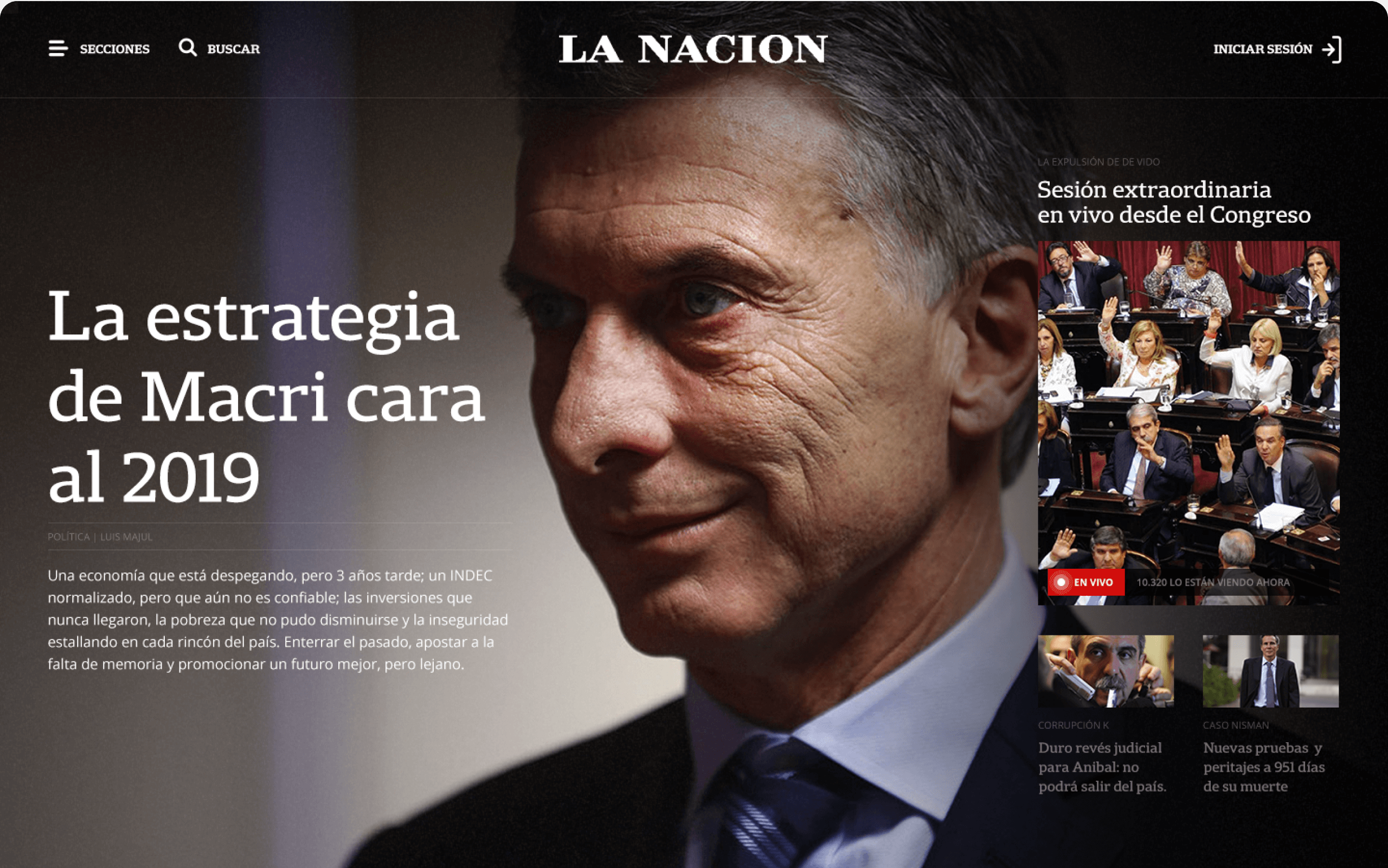
With a full screen, photographic and direct homepage, we give the users a stunning welcome. There is no doubt what is the most relevant news of the moment. With this proposal we seek to seduce the reader, captivate him and immerse him in the news so that he can then dive into the portal.


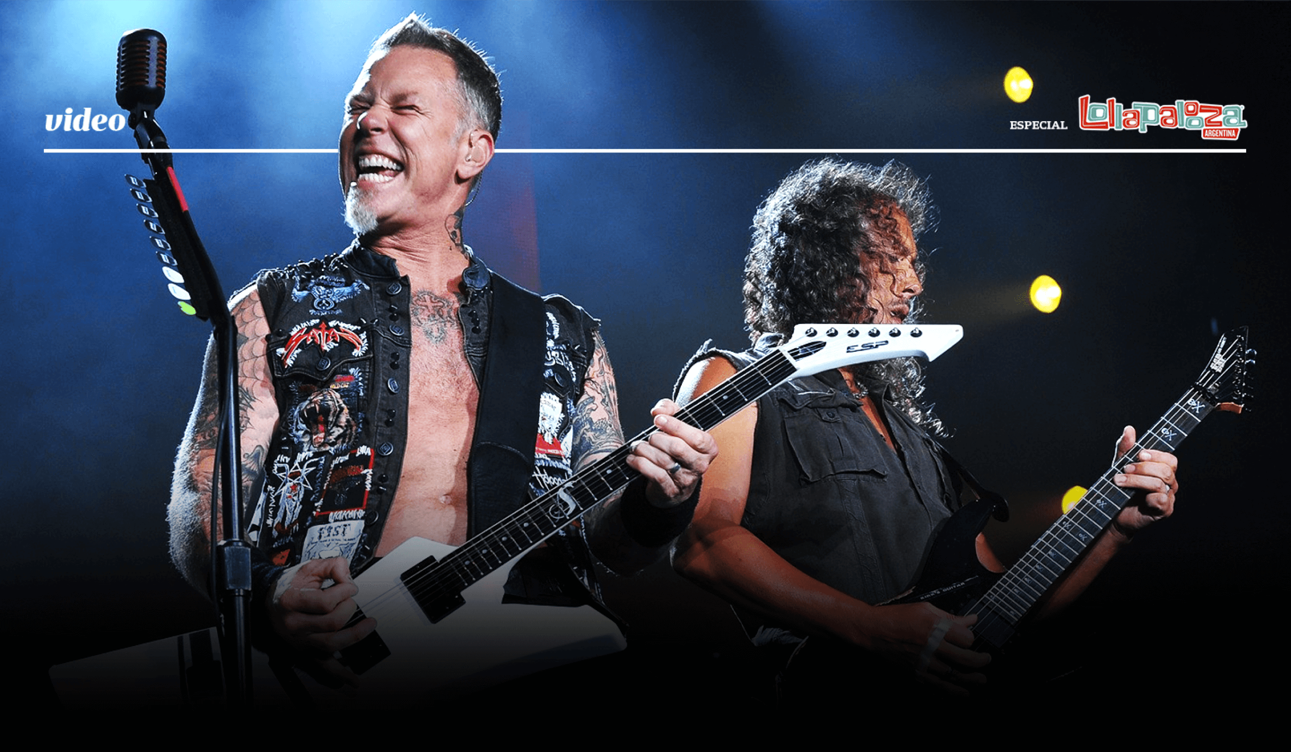
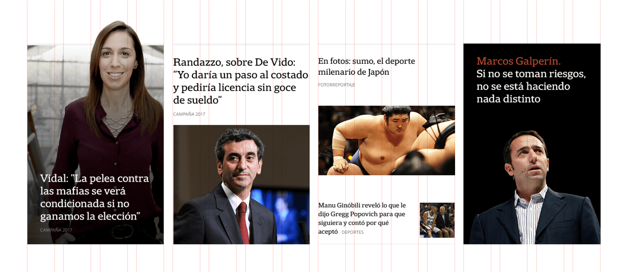
The proposal is structured on a solid grid that allows responding to the different needs of the segments and categories without giving up creative freedom. With a clear classic focus, we wanted to propose the reinvention of the news portal through the eyes of the design craft: stylized, harmonic, suggestive and symbiotic with the information it contains.


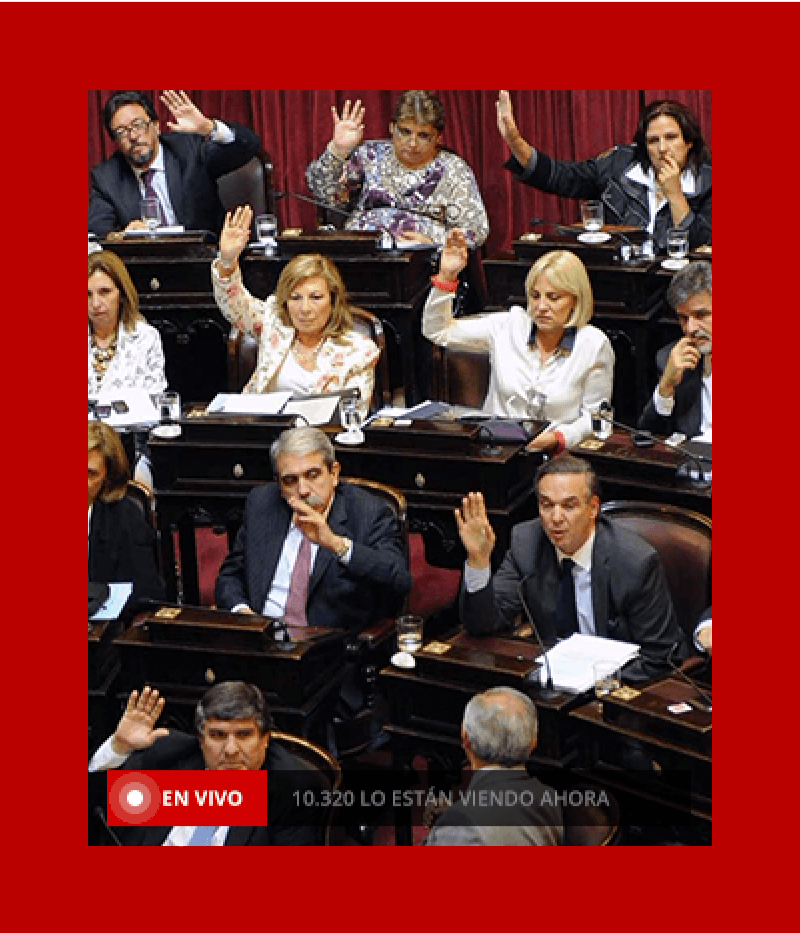
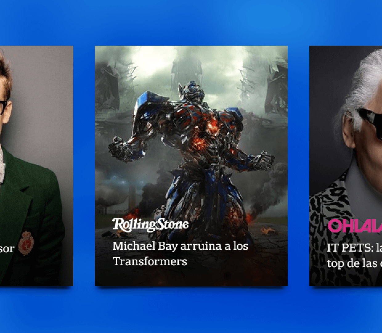
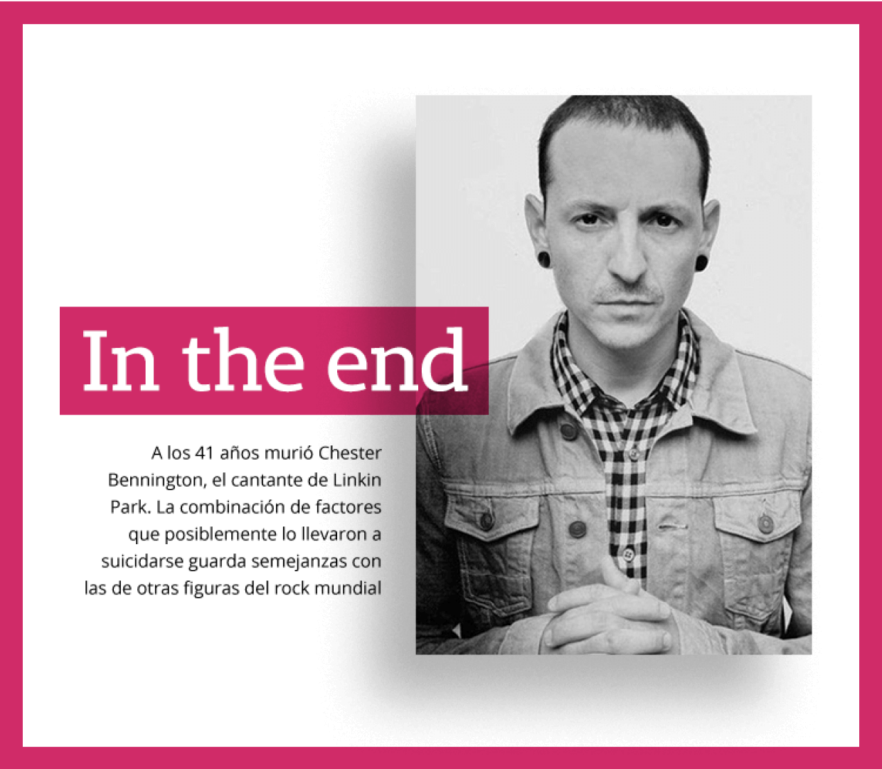
In the era of statistics and absolute systematization, there are very few chances to play and be artistically free.
Structurally disruptive and informatively modern. Through interactive infographics we brought the printed world to life: editorially structured and digitally interactive.
Structurally, we experimented with an odd grid, which allowed us to create systematically irregular spaces that provided rhythm in reading and in the construction of spaces that, together with the outstanding photographs, break the monotonism in the systematization of the news feed.


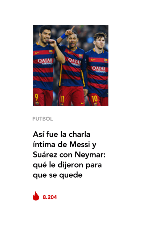
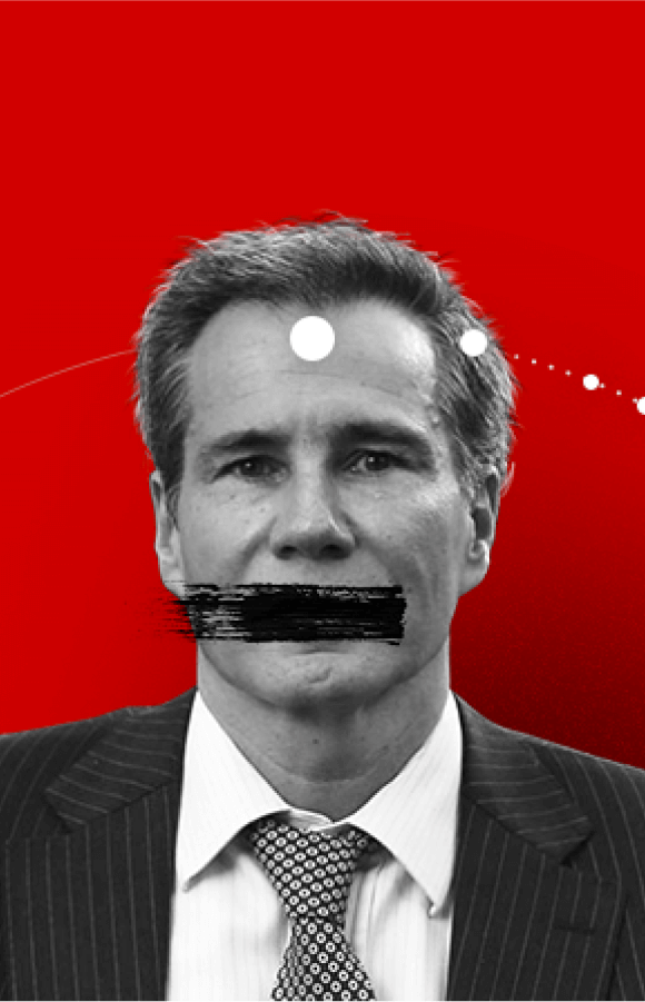
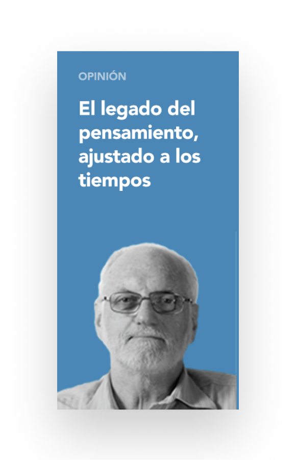
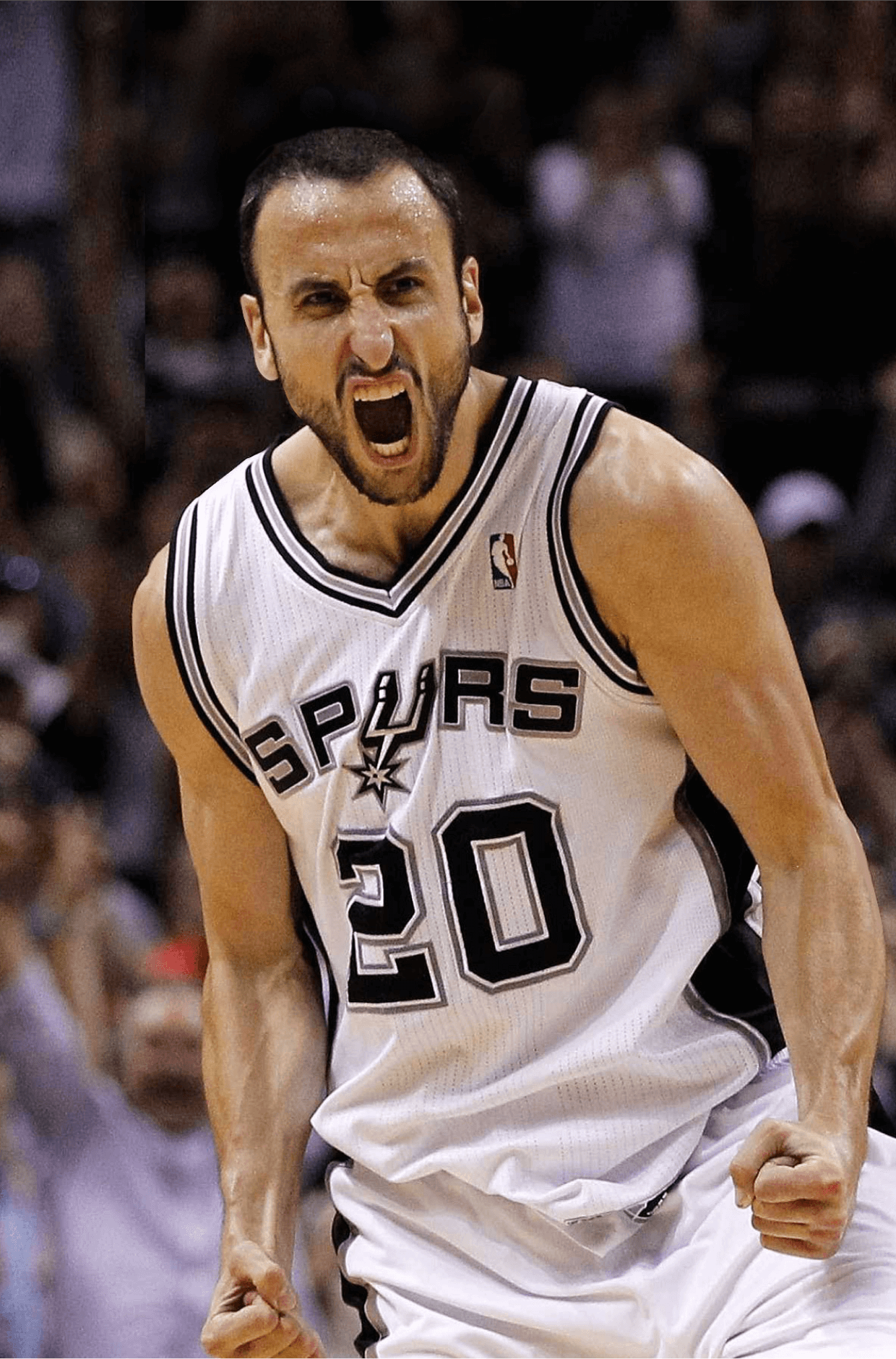
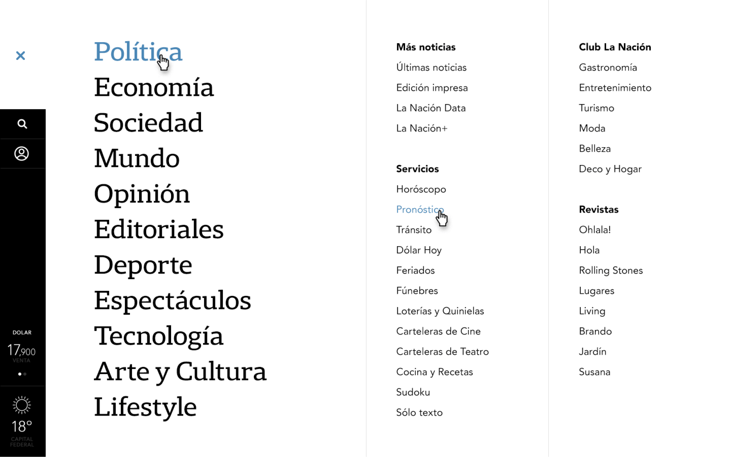
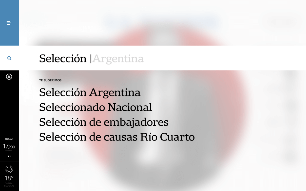
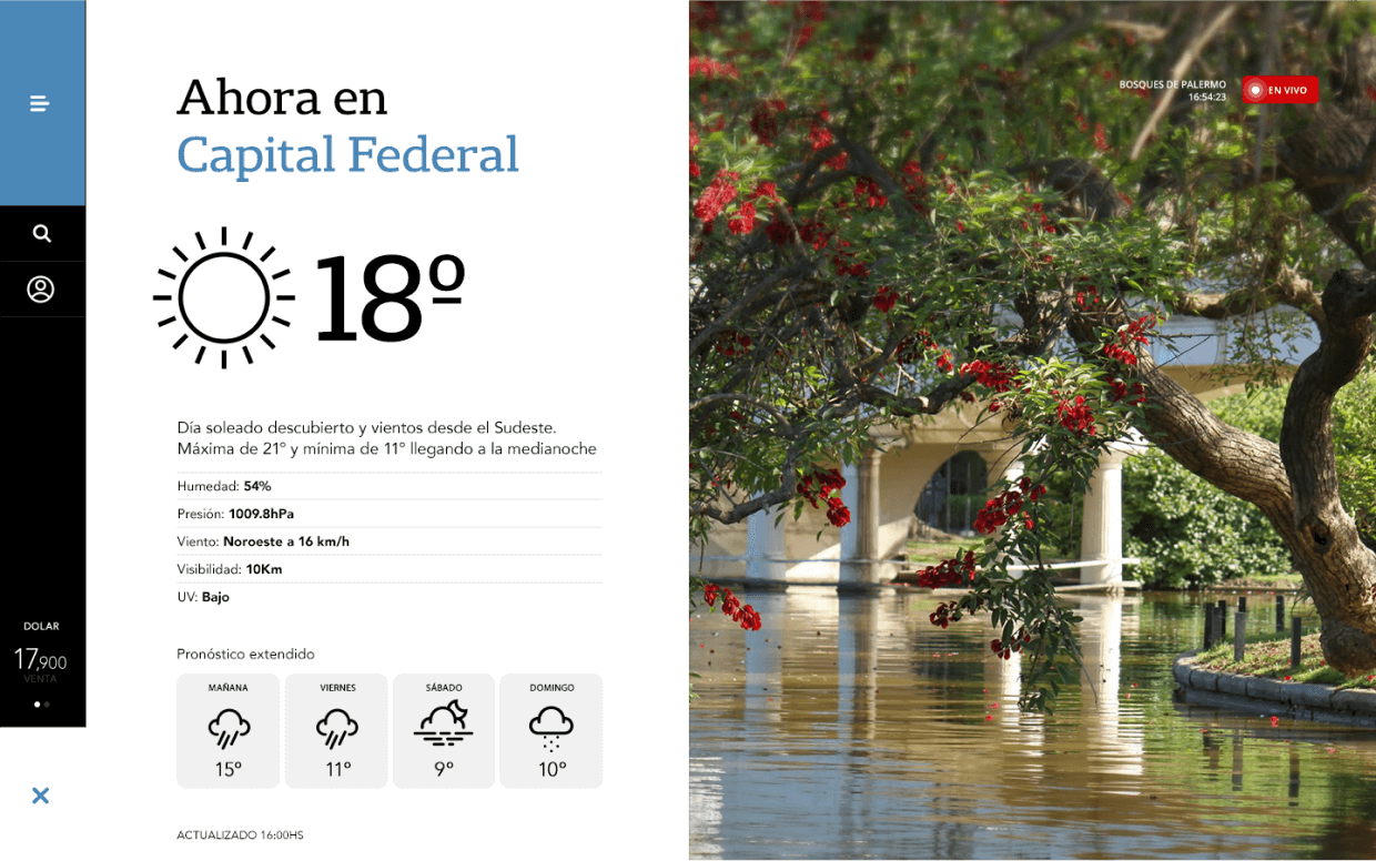
Experimentation was carried out with a sidebar where the menu is always accesible, as well as the main widgets that can be defined by the user to display what is considered relevant (weather, currency prices, the next match of his team, statistics of his political party, etc.)
